Etsy Star Seller
I’m a Star Seller on Etsy this month! That means you can purchase from my Etsy shop knowing I have a record of providing an excellent customer experience.
I’m a Star Seller on Etsy this month! That means you can purchase from my Etsy shop knowing I have a record of providing an excellent customer experience.
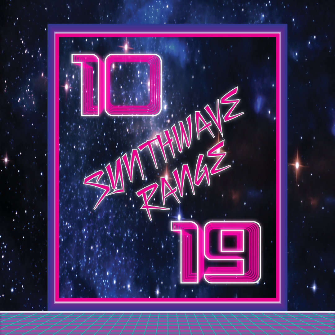
Early 2000’s music and art style, synthwave, inspired this range of birthday cards. Ages 10 to 19 available. Add personalised name and inside message. Choose size.
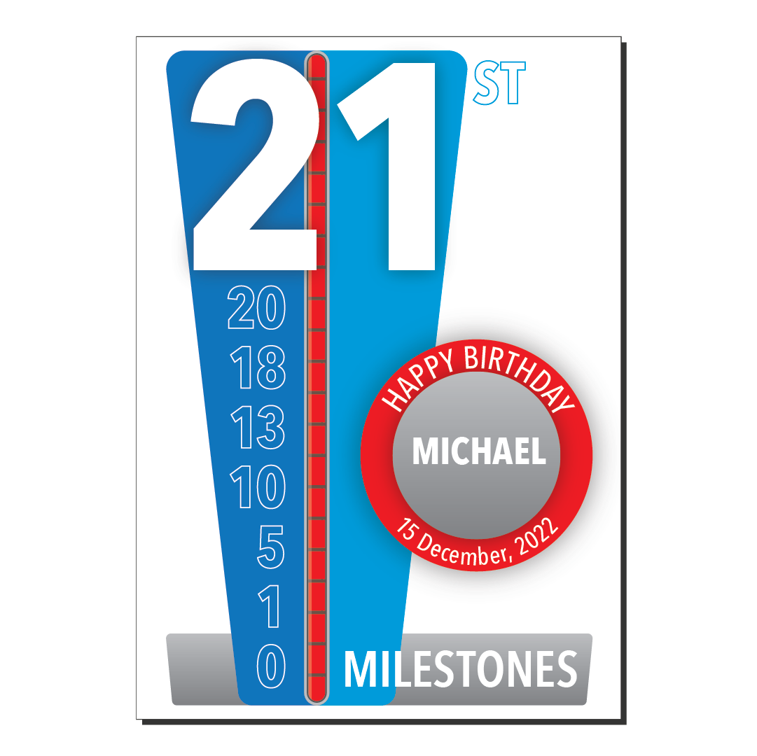
We celebrate many milestones during our life. From birth to death we strive for and pass many goals, some of which are age based. These personalised 21st birthday cards celebrate one of the biggest.
My design was the winner in a 99designs logo competition for hopaYacht.com. Logo’s graphic design uses “h” and “y” in reflection. Read the design story.
You must be logged in to post a comment.