2017 Australian Orienteering Carnival
The 2017 Orienteering Championships Carnival of 7 seven events included the Australian Orienteering Championships. The Carnival was centred on the Hill End area of central NSW. This region is one of the gold-mining regions of Australia and where gold was first discovered. The terrain is riddled with the remnants of the 1850’s gold rush and the effect it has had on the landscape. Pits, mine shafts, adits, contouring water channels, dams walls, etc were constructed by the miners in their hunt for gold. Since that time water has eroded the landscape creating intricate changes to the natural contours. All this leads to one of the most interesting and challenging landscapes to orienteer in.
Orienteering NSW’s organiser for the event was having difficulty choosing from a selection of preliminary logo designs and asked Stuart for his opinion, knowing that he was an Architect and understood design. That became the start of Stuart’s graphic design journey. The submitted designs had hints of good ideas but none had a complete inspiring idea that he could recommend. As a keen orienteer himself, he decided to design an alternative which became the carnival logo.
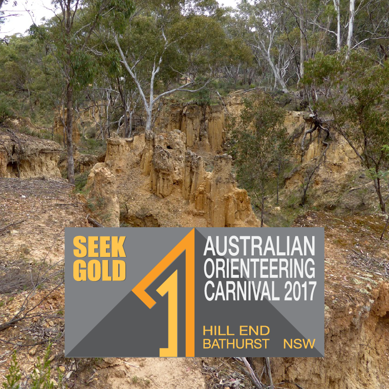
The key concept for the logo design year was number “17” in the form of a north point. Placing the “17” onto the diagonal of an orienteering flag triangle gave secondary concepts of a mountain and trees. The tagline “Seek Gold” had the idea of the gold-mining region and of winning a competition. This created a standalone square logo with minimal text that could be used separately. To include the event name and location, the background design was mirrored. The two squares could be placed side by side or stacked vertically to suit the surrounding artwork. The colour scheme uses golden colours on a neutral grey background.
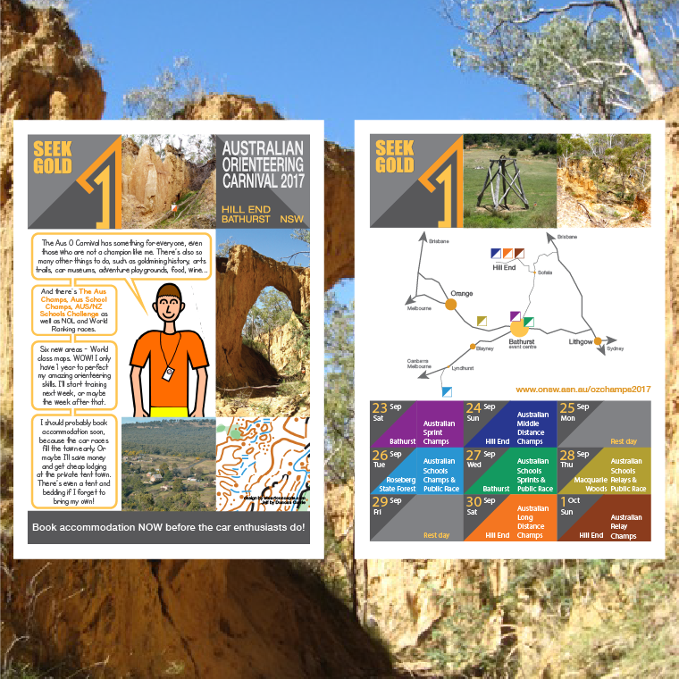
Due to relocating to Melbourne, Stuart’s involvement with implementation of the design for the Carnival had to be limited. He gave guidance on the design concepts for the Carnival website. The flyers used the same elements as on the website to identify the 7 events. To keep the flyers fun, young orienteer and cartoonist, Duncan Currie helped with “Jeff” his orienteering cartoon character who keeps making mistakes.
Australian Orienteering Championships 2022
In 2020, the Orienteering Victoria (OV) organisers for the 2021 Australian Orienteering Championships where presented with a unusual challenge. Would their competition be held in 2021 or be postponed until 2022 due to the COVID-19 pandemic?
As the graphic designer on the team, Stuart had to design a logo concept that was adaptable for the possible change. For 2021, the numbers “2” and “1” were arranged as opposing arrows suggesting direction north and south over a background in the shape of an orienteering flag with the Orienteering Victoria colour palette. Once it was decided that the competition would be in 2022, it was simple to switch out the “1” for a “2.”
Once the logo concept was accepted a style guide was prepared. That ensured the promotional materials, competition information and arena design were all consistent. Stuart developed and maintained the website concept with others working on the content. He assisted the team assembling the information necessary for the two bulletins. This included designing icons for the use in diagrams and to highlight common details on each day’s information pages. Many of the concepts developed for these bulletins have since been used by the organising teams for other major orienteering carnivals.
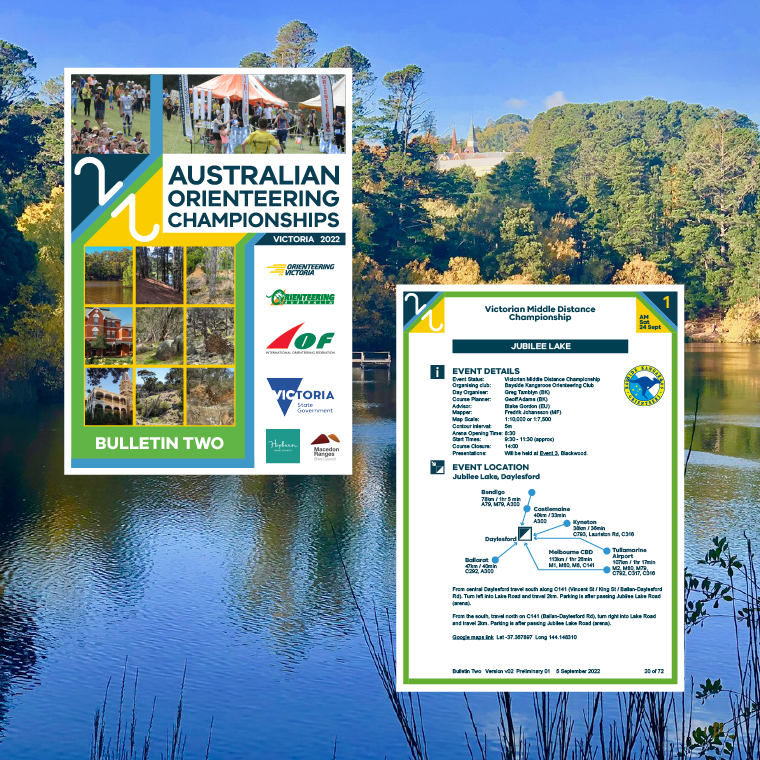
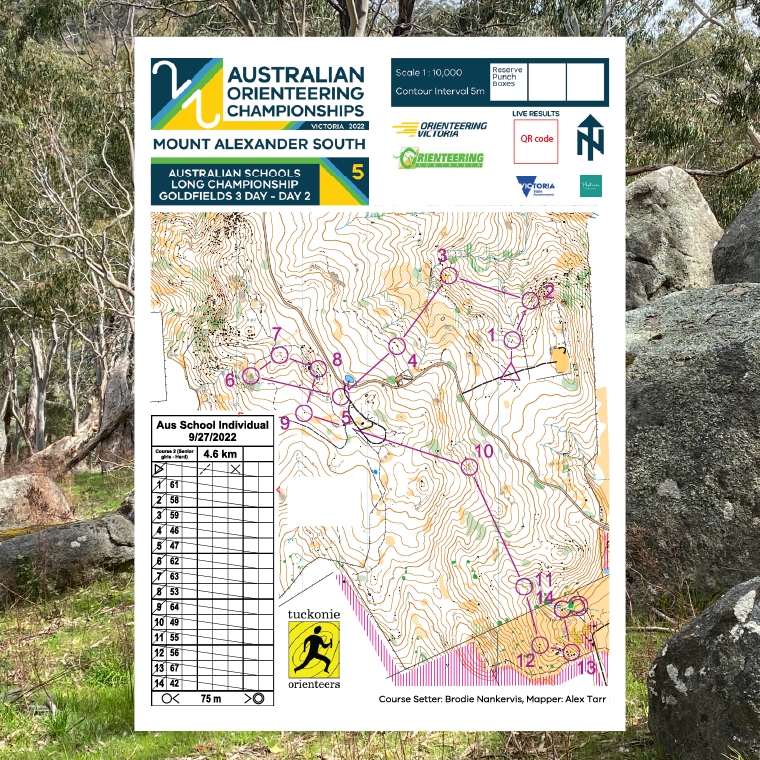
Other assets designed were signs, banners, flyers, bibs and certificates. For the mappers, a style template was prepared to ensure consistency to the layout and information components on each competition map.
Australian Orienteering Championships 2024
When packing up for the 2022 Australian Orienteering Championships, the organisers for the 2024 edition approached me to do similar design work for their events. The area would be very interesting granite terrain in the Armidale / Northern Tablelands region of New South Wales. They had a concept of using a different colour from the 7 colours of the rainbow to identify each event.
The design challenge therefore was how to incorporate a rainbow theme into the logo design. The final design blended an orienteering flag with radiating rainbow colours. This was wrapped by white and dark brown lines forming “24.” The golden background and dark reddish brown lines where chosen as they contrasted with all the rainbow colours.
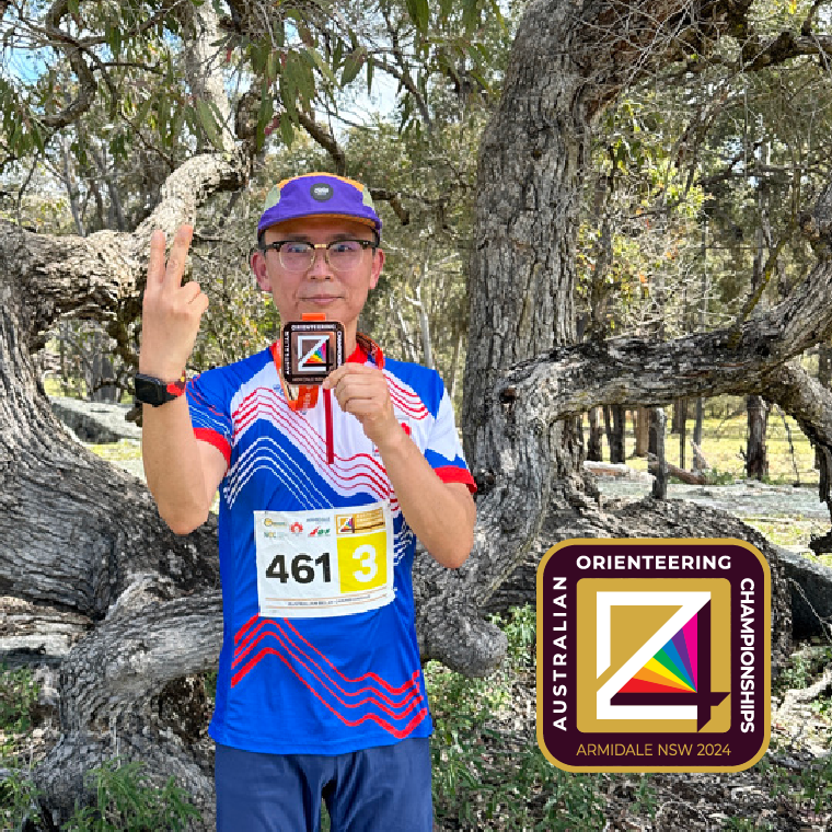
The graphic design work for the championships included designing the medals and bibs for each event. For the medals, the golden colour in the artwork became the base metal colours for gold, silver and bronze to identify the placings. The medal lanyards were a different colour of the rainbow for each event. Competitors wore bibs, but the requirements for each event varied. Therefore the concept was adaptable to allow for the various versions for the elite and public races. Below, Frankie Shin is wearing the third leg runners bib for the relays.
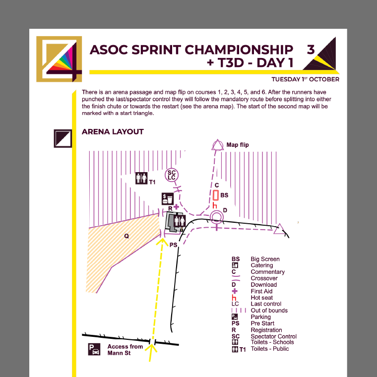
The rainbow theme was used extensively in the materials prepared for the championships. For instance in Bulletin 2, each events colour identified its detail pages. Top right was the rainbow triangle with the colour highlighted together with its event number. For example as shown below, day 3 was yellow. All pages for that event featured the header and left and top rulers in yellow, so readers could know which event they were reading about. Maps for each event also used the same elements. This section also included arena layout diagrams. Events organisers would send through sketches which Stuart then drew with a consistent palette of symbols and colours across all events.