Stuart McWilliam has been involved with the graphic design for the 2021, 2025 and is currently working with the organisers for 2027 Australian Orienteering 3-Days events.
Easter 2027
The Orienteering NSW team are in the planning stage for 2027 Australian Orienteering 3-Days to be held in the Goulburn area. So far, Stuart has designed the logo, a flyer and an article for the Australian Orienteer magazine. The next task will be Bulletin 1.
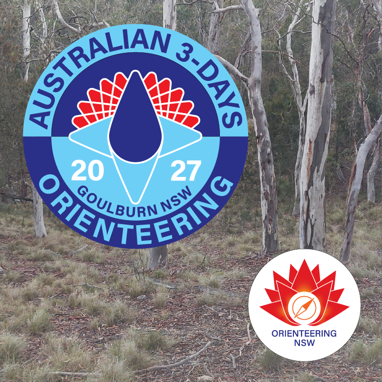
At the time of designing the logo the location was not known, therefore it was decided to focus on the NSW waratah as the key element. The basic petal shape of the Orienteering NSW logo was used. These were arranged in a radial pattern to create a waratah and 4 compass points. The colour scheme was adopted from the ONSW style guide which Stuart had prepared in 2024.
Easter 2025
Orienteering Victoria hosted the 2025 Australian Orienteering 3-Days in the Loddon Shire. Stuart joined the organising team as the graphic advisor.
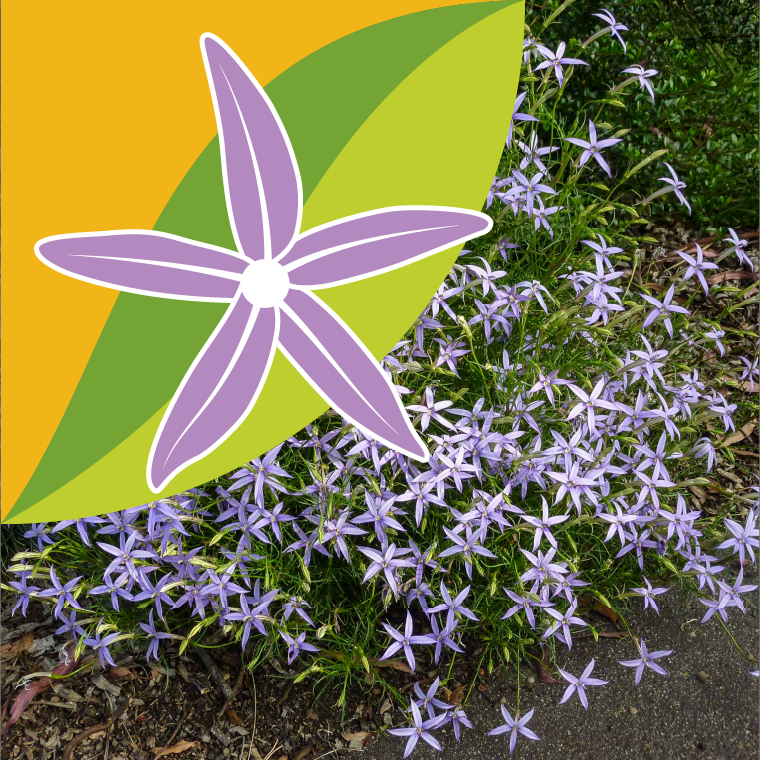
As the Loddon Shire were providing significant support for the Carnival, a requirement was that the logo and graphics had to be compatible with their colour palette. The organising team suggested that the tiny rock isotome, Isotoma axillaris found in the region would be a good element to include in the design of the logo.
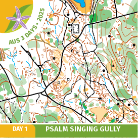
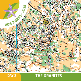
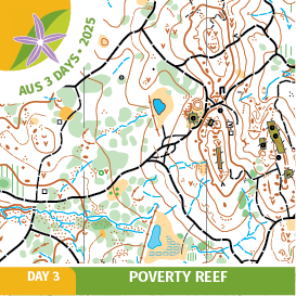
A unique feature of the carnival was that every finisher was given a coaster as they finished their competition as a memento. Each coaster included a snippet of the map they had just competed on.
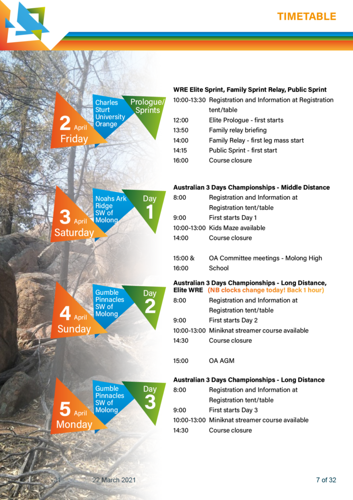
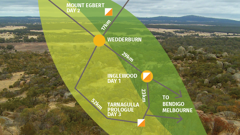
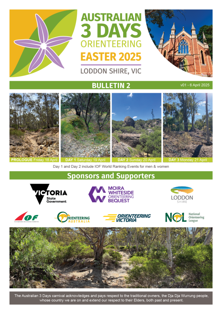
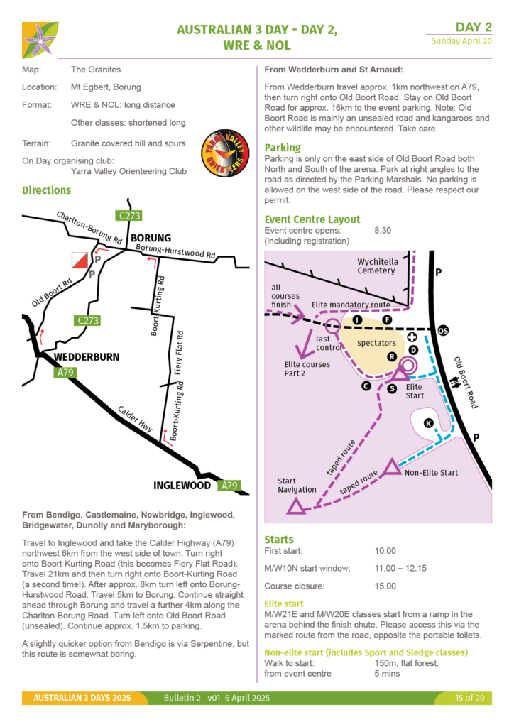
Traditional bulletins have used single column layouts. The organisers were keen to explore using two columns the the Easter 2027 bulletins. This achieved a 20% reduction in the number of pages and proved to be much easier for competitors to find the information they needed.
Stuart uses Adobe Indesign to prepare the bulletins from Word documents provided by the team. These documents communicate the features of the event, so it is important they are logical and consistent. Draft diagrams were redrawn in Adobe Illustrator to ensure consistency across the document. In addition, sections were rearranged to have a logical flow of information from getting there, arrival and the competition.
Easter 2021
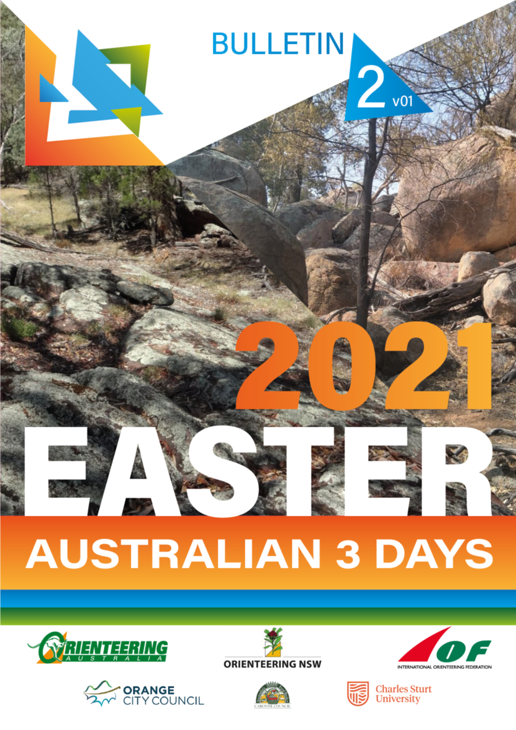
The organisers for the 2021 Australian Orienteering 3-Days already had a logo and requested Stuart to assist in compilation and presentation of the Bulletins for the event. The challenge therefore was to discover ways to adapt his design style to work with the logo provided.