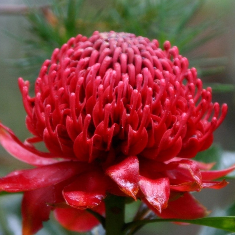
In springtime, the magnificent red flowers of the waratah (Telopea speciosissima) stand out in the bush around Sydney which makes it a perfect choice for the emblem for the state of New South Wales and also for Orienteering NSW.
When Orienteering NSW was formed, Dave Lotty designed its logo which featured the waratah and an orienteering flag which is what you are looking for at the control feature on your course. Dave was the cartographer for a large number of orienteering maps.
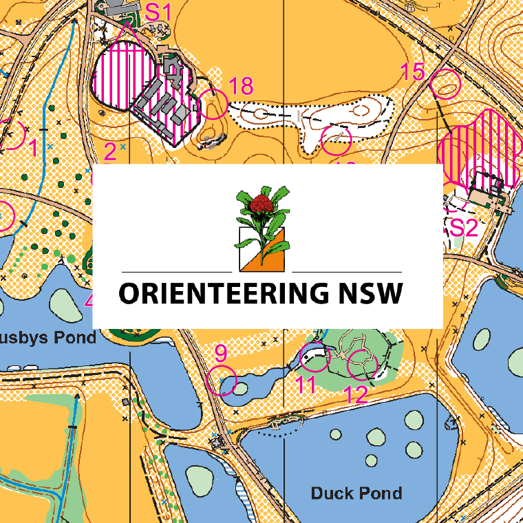
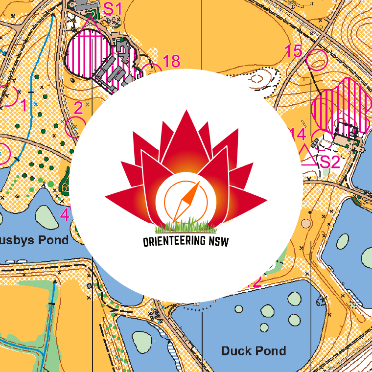
The background in the above images is the Centennial Park orienteering map which Dave Lotty fieldworked and did the cartography. He updated the map at least 14 times! You can run the permanent orienteering course using the map downloaded here.
Orienteering NSW went through a design and selection process for their second logo shown above. They wanted a more modern design which still featured a waratah flower. The orienteering flag has been replaced with a compass which is used to navigate when doing your orienteering course.
When using this second version of the logo with other orienteering logos in various orienteering promotional materials, Stuart found that it didn’t have the same refinement. He therefore prepared an analysis of the design and made suggestions to Orienteering NSW to improve the logo. The issues identified were:
- non-symmetrical layout of the petals
- grass element too detailed and not relating to orienteering
- text not readable when scaled down
- compass alignment is awkward in relation to the petals
They agreed for Stuart to investigate alternative designs. The initial designs presented looked at different construction concepts for the petals. ONSW considered these, however decided that the basic concepts of waratah, compass and colour of the logo should be maintained. Therefore Stuart worked on fine tuning these elements. His refined design was adopted as their official logo in 2024.
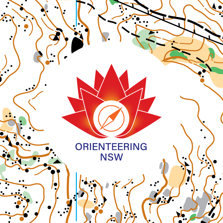
The final artwork package included .ai, .eps, .png, .jpg and .pdf file versions as well files with transparent backgrounds and a black and white version.
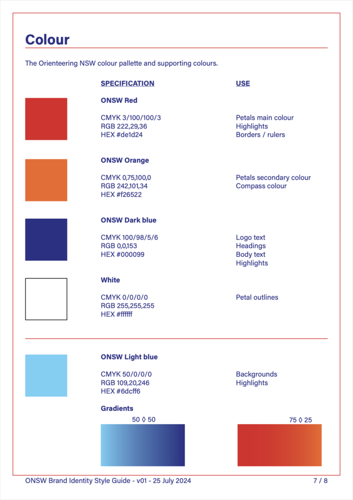
Orienteering NSW didn’t have a style guide which made it difficult for designers to find out the details for preferred colours and fonts when preparing artwork. Thus at Stuart’s suggestion, a brand guide was prepared for the new 2024 version of the logo. This guide included:
- How to place the logo in artwork, including the clear space around and minimum sizes for print and web use.
- Examples of incorrect placement, such as backgrounds and distortion.
- Which file type to use in different situations.
- Font specifications
- Colour palette specifications and uses.